
Structural Time Series
FF16 · ©2020 Cloudera, Inc. All rights reserved

This is an applied research report by Cloudera Fast Forward Labs. We write reports about emerging technologies. Accompanying each report are working prototypes or code that exhibits the capabilities of the algorithm and offer detailed technical advice on its practical application. Read our full report on structural time series below or download the PDF. You can view and download the code for the accompanying electricity demand forecast experiments on Github.
Introduction
Time series data is ubiquitous, and many methods of processing and modeling data over time have been developed. As with any data science project, there is no one method to rule them all, and the most appropriate approach ought to depend on the data in question, the goals of the modeler, and the time and resources available.
We have often encountered time series problems in our client-facing work at Cloudera Fast Forward. These come in a variety of shapes and sizes. Sometimes there are millions of parallel time series, where external factors are expected to be extremely predictive, and there is a single well-defined metric to optimize. At the other end of the spectrum is a single, noisy time series, with many missing points and no additional information. In this report, we will focus on approaches that are more suited to the latter case. In particular, we will investigate structural time series, which are especially useful in cases where the time series exhibits some periodic patterns.
We will describe a family of models—Generalized Additive Models, or GAMs—which have the advantage of being scalable and easy to interpret, and tend to perform well on a large number of time series problems. We’ll first describe what we mean by a structural time series and generalized additive models. Then, we’ll cover some considerations for model construction and evaluation. Finally, we’ll walk through a practical application, in which we’ll forecast the demand for electricity in California. (This report is accompanied by the code for that application.)
What is a structural time series?
Many time series display common characteristics, such as a general upwards or downwards trend; repeating, and potentially nested, patterns; or sudden spikes or drops. Structural approaches to time series address these features explicitly by representing an observed time series as a combination of components.
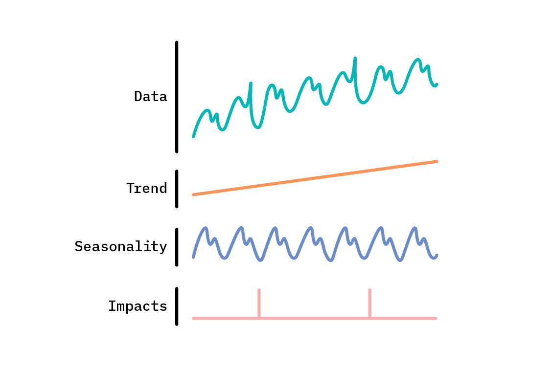
There are two broad approaches to structural time series. In the first, a structural time series is treated as a state space model. In this approach, the values of the time series we observe are generated by latent space dynamics. This encompasses an enormously broad and flexible class of models, including the likes of ARIMA and the Kalman filter. Popular open source packages like bsts (Bayesian Structural Time Series, in R) and the TensorFlow Probability sts module support the state space model formulation of structural time series.
In the second approach, structural time series are generalized additive models (GAMs), where the time series is decomposed into functions that add together (each of which may itself be the product or sum of multiple components) to reproduce the original series. This approach casts the time series problem as curve fitting, which does incur some trade-offs. On the upside, it renders the model interpretable, easy to debug, and able to handle missing and irregularly spaced observations. On the other hand, we are likely to lose some accuracy, as compared to autoregressive approaches that consider the previous few (or many) data points for each next prediction. Just as with state space models, GAMs may be treated in a Bayesian fashion, affording us a posterior distribution of forecasts that capture uncertainty.
Both approaches have their place. In this report, we’ll discuss the latter. The GAM approach is not universally referred to as a structural time series (which more often refers to state space models), but here we take a broader view of the term: a structural time series model is any model that seeks to decompose time series data into constituent components—which generalized additive models can be applied to do.
The components
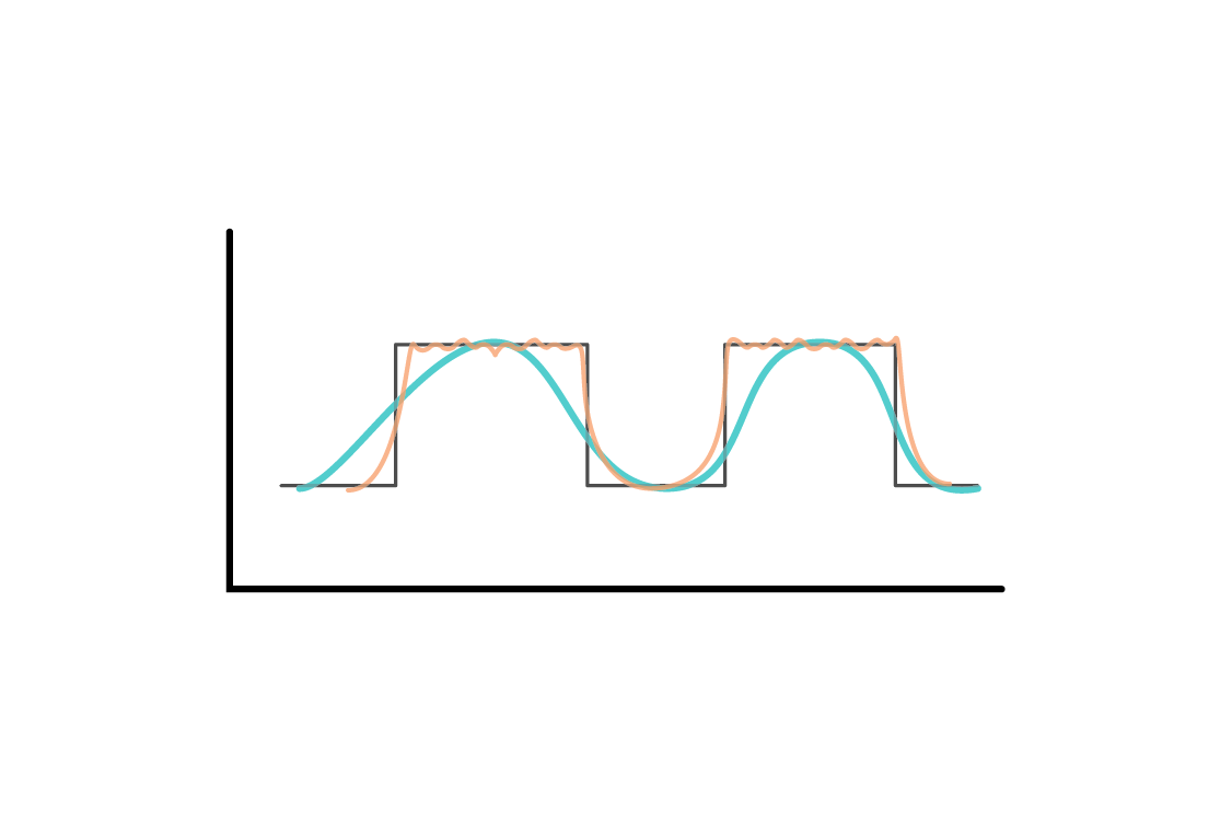
Generalized additive models were formalized in their namesake paper by Hastie and Tibshirani in 1986. They replace the terms in linear regression with smooth functions of the predictors. The form of those functions determines the structure, and thus flexibility, of the model. When applied to univariate time series, the observed variable is deconstructed into smooth functions of time. There are some functions that are common to many time series, which we will outline here. Schematically, the model we are describing looks something like this:

Let’s take a brief look at each of the components that contribute to the observed time series values.
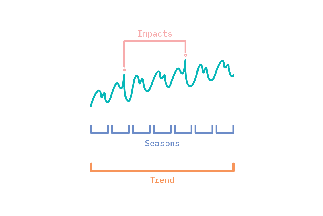
Trend
Over a long enough window of time, many time series display an overall upward or downward trend. Even when this is not the case (i.e., the time series is globally flat), there are often “local” trends that are active during only part of the time series.
Many possible functions could be used to model trend, so selecting an appropriate function is up to the modeler. For instance, it may be apparent from the data that the observed quantity is growing exponentially—in which case, an exponential function of time would be fitting.
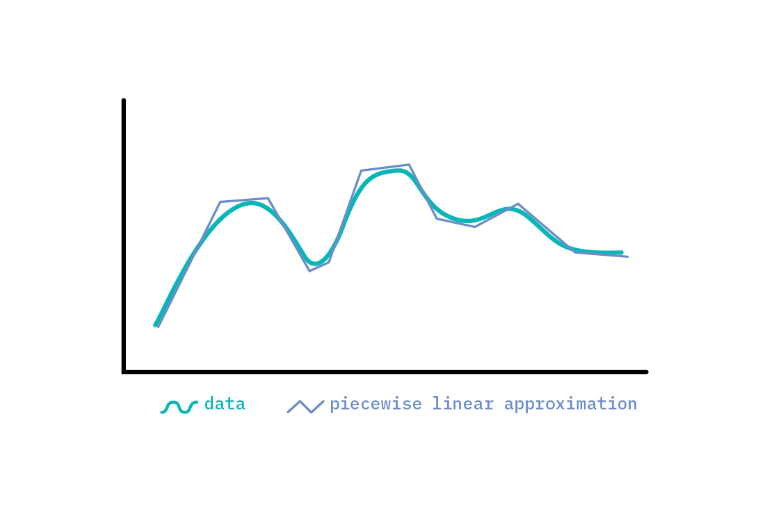
When the trend of a time series is more complex than overall increase or decline, it may be modeled in a piecewise fashion. It is possible to model very nonlinear global tendencies with piecewise linear approximations, but we must be careful not to overfit; after all, any function may be approximated well with small enough linear segments. As such, we should include some notion of how likely a changepoint (a point where the trend changes) is. One means of doing so is to start with many potential changepoints, but put a sparsity-inducing prior[1] over their magnitude, so that only a subset is ultimately selected.
Many processes have an intrinsic limit in capacity, above (or below) which it is impossible for them to grow (or fall). These saturating forecasts can be modeled with a logistic function. For instance, a service provider can serve only so many customers; even if their growth looks linear or exponential to begin with, a fixed upper limit exists. An advantage of a structural approach is that we can encode this kind of domain knowledge into the components we use to model a time series. In contrast, black-box learners like neural networks can encode no such knowledge. The trade-off is that when using a structural model, we must specify the structure, whereas a recurrent neural network can learn arbitrary functions.
Seasonality
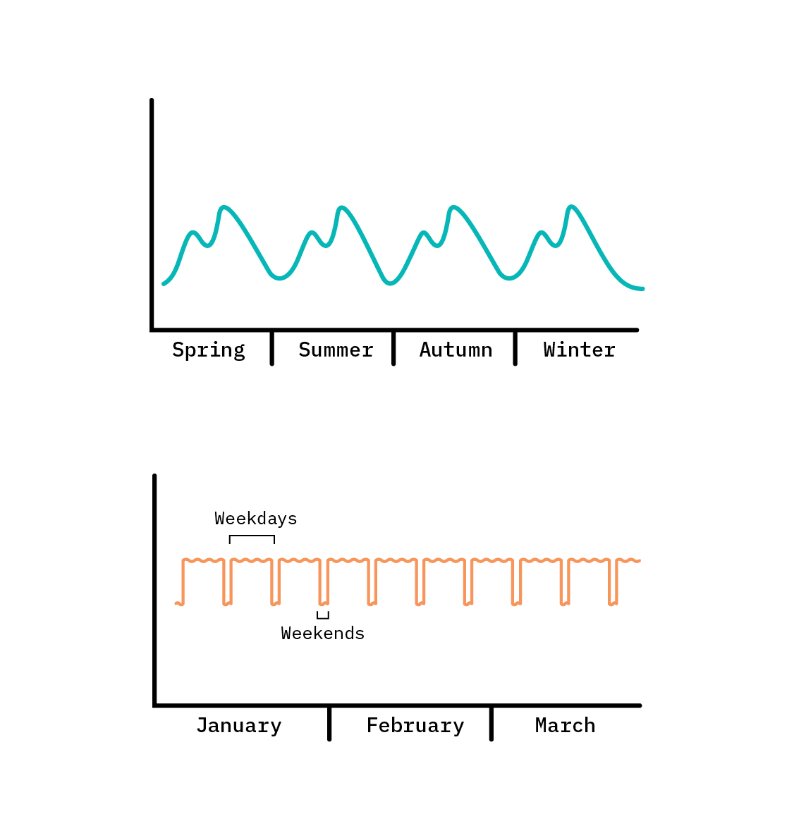
Structural approaches to time series are especially useful when the time series displays some seasonal periodicity. These may correspond to the natural seasons, but for the purpose of modeling, a seasonal effect is anything that is periodic—a repeating pattern. In the natural world, many things (for example, the tides) exhibit an annual, monthly, or daily cycle, corresponding to changes caused by the relative motion of the Sun, Earth, and Moon. Likewise, in the world of commerce and business, many phenomena repeat weekly, while often demonstrating very different behaviour on weekdays and weekends.
To encode arbitrary periodic patterns, we need a flexible periodic function. Any periodic function can be approximated by Fourier series. A Fourier series is a weighted sum of sine and cosine terms with increasingly high frequencies. Including more terms in the series increases the fidelity of the approximation. We can tune how flexible the periodic function is by increasing the degree of the approximation (increasing the number of sine and cosine terms included).
A Fourier expansion guarantees the periodicity of the component; the end of a cycle transitions smoothly into the start of the next cycle. The appropriate number of Fourier terms for a component may be set either by intuition for how detailed a seasonal pattern is, or by brute hyperparameter search for the best performance.
Generalized additive models may have multiple seasonal components, each having its own periodicity. For instance, there may be a repeating annual cycle, weekly cycle, and daily cycle, all active in the same time series.
Impact effects
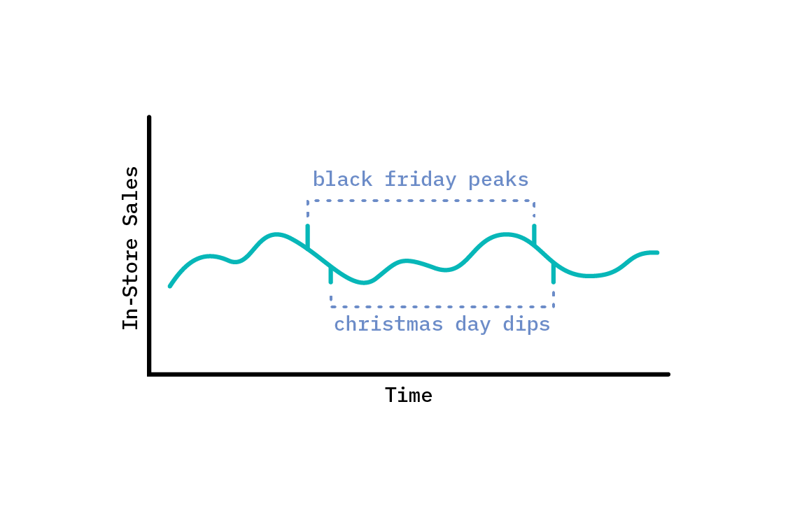
Some time series have discrete impact effects, active only at specific times. For instance, sales for some consumer products are likely to peak strongly on Black Friday. This isn’t part of a weekly recurring pattern; sales don’t peak to the same level on every Friday. The date of Black Friday also moves annually. However, whenever it is Black Friday, sales will spike.
We can model such discrete impact effects by including a constant term for them in the model, but having that term only be active at the appropriate time. Then, the coefficient of the term quantifies the additional effect (positive or negative) of it being a certain day (or hour, or other time period), having accounted for the seasonal and trend components. This additional constant effect will be added any time the indicator is active. This kind of component is especially useful for modeling holidays, which occur every year, and often on a different day of the week.
In order to learn such effects, we must have several examples of the event or holiday. Otherwise, we’ll introduce a new parameter for a single data point, and the component will also fit any extra noise at the time it is active.
External regressors
Up to this point, we have been considering a strictly univariate time series, where the only predictor of the observed variable is time. However, treating time series modeling as curve fitting means that we can include any extra (i.e., external) regressors we like, just as in regular regression. In fact, the impact effects we just discussed are really extra regressors that take binary values. When modeling electricity demand, as we do below, we could include outdoor temperature as an external regressor that is likely to carry a lot of information (in our example, we do not do this, though we could almost certainly improve our ultimate metrics by doing so).
There are a few things to bear in mind when adding regressors. The first is the interpretability of the prediction. Each forecast value is the sum of the components active at that point. Including extra regressors makes interpretation of the model a little more complicated, since the prediction no longer depends only on time, but also on the values of extra regressors. Whether the more subtle interpretation is a worthwhile trade-off for increased predictive power is a decision the modeler will need to make, based on the problem they need to solve.
Second, including external regressors often introduces another forecasting problem. If we would like to predict what the electricity demand will be next week, and we rely on temperature as a predictor, we’d better know what the temperature will be next week! Whereas some predictors may be known ahead of time—the day of week for instance, or whether the day is a national holiday—many predictors must themselves be forecast. Naturally occurring examples (that relate to our electricity demand forecast example) include temperature, humidity, or wind speed, but any feature that we do not have reliable knowledge of ahead of time engenders this problem.
This complication, however, is not insurmountable. We could create a forecast depending on temperature, and then forecast multiple scenarios corresponding to different predictions about the temperature. It would be important, though, when producing a general forecast, to correctly account for the additional uncertainty in the prediction that arises from forecasting the features.
Evaluating time series models
We’ve briefly described the building blocks of generalized additive models for time series. Before we fit a model to some data, we must decide how to evaluate the fit. There are several considerations here that are unique to time series data.
Horizons
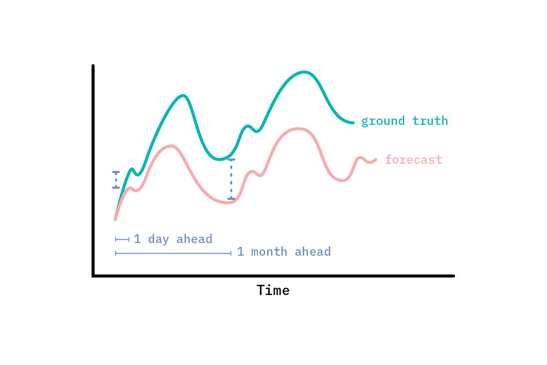
Time series forecasts are often evaluated at multiple time horizons. The appropriate time horizon at which to evaluate a forecast depends entirely on the ultimate purpose of the forecast. If we want to build a model that will mostly be used to predict what will happen in the next hour (with data in hourly intervals), we should evaluate the accuracy of the forecast one step ahead. We could do this with a moving window approach that first trains on an early part of the time series and predicts a single step ahead. We would then evaluate those predictions and move the training window one (or more) time steps on, and repeat the process. This will allow us to build up a picture of how good a forecast is at that particular time horizon (one step ahead).
Other times, we may be interested in how a forecast performs at multiple horizons—in which case, we can simply repeat a version of the above, but calculatie performance metrics multiple steps ahead each time.
For some time series problems, especially those on which we’re likely to adopt a curve fitting approach, n-step ahead forecasting does not make sense, since the observations are unequally spaced, and there is no notion of one time step. For long term forecasts, especially when treated with a curve fitting approach, we may be interested not in performance at some fixed horizon, but rather for a whole period—for instance, the aggregate performance over a whole year (which is the approach we’ll take to electricity demand). In these cases, we may use an evaluation process that looks more like what we do for regular supervised learning model evaluation: separating train, test, and validation data sets.
Do not cross-validate time series models
Data observed as a time series often carries a correlation through time; indeed, this is what makes it worthwhile to treat as a time series, rather than a collection of independent data points. When we perform regular cross-validation, we leave out sections of the dataset, and train on others. Doing so naively with time series, however, is very likely to give us falsely confident results, because the split occurs on the time variable; we may be effectively interpolating, or leaking trend information backwards.[2] Time series data violates the assumption of independent and identically distributed (i.i.d.) data that we often use implicitly in supervised learning.
For example, if we include both June and August in a fictitious training set, but withhold July for testing, a good estimate of the model’s true performance is improbable, since the time series in July is likely to interpolate between June and August. Essentially, by cutting out chunks mid-way through the time series, we’re testing a situation that will never be the case when we come to actually predict, because we never have information from the future. When we predict, we only have information about the past, and we should evaluate our forecast accordingly.
To perform the equivalent of cross-validation on a time series, we should use a technique called forward chaining, or rolling-origin, to evaluate a model trained on multiple segments of the data. To do so, we first chunk our data in time, train on the first n chunks and predict on the subsequent chunk, n+1. Then, we train on the first n+1 chunks, and predict on chunk n+2, and so on. This prevents patterns that are specific to some point in time from being leaked into the test chunk for each train/predict step.
Baselines
The process of developing a solution to almost any supervised learning problem should begin with implementing a baseline model. The kind of baseline to use depends on the problem. For instance, in a generic classification problem, a sensible baseline is to always predict the majority class. With that baseline model, we can compute all the classification metrics we’d like. Then, any better model we build on top of it can be compared against those metrics. A classification accuracy of 91% may sound impressive, but if simply predicting the majority class gives an accuracy of 95%, it’s clear our model is junk!
An oft-used baseline for time series problems is a naive one-step ahead forecast, where the prediction for each time step is simply the observed value at the previous time step. This makes perfect sense when working with short time scales, and when the thing we care about most is the next step. However, in the kind of seasonal time series that an STS model is good at dealing with, one-step ahead prediction is not so useful; the model does not adapt on short time scales to new information. Even if one were to re-fit the model on an additional data point, it would be unlikely to change the forecast much, due to the highly structured nature of the model. The strength of this kind of structural model is in longer-term forecasting.
A sensible baseline is the seasonal naive forecast: rather than predicting the value at each time step to be the same as the observed value at the previous time step, we instead predict it as having the same value as at the equivalent point in the previous period in the season. For instance, if we have a daily periodicity, we could predict that each hour in a day will have the same value as it did at the same hour in the previous day. When dealing with multiple periods of seasonality, to capture one full period of seasonality, we must offset by the longest seasonality. For example, in the electricity demand forecasting problem we tackle below, we use a baseline forecast of predicting a repeated year, since there are strong patterns of seasonality at the yearly, weekly, and daily level, and a year is the longest of those seasons.
Once we have a sensible baseline for our time series, we can compute metrics for the quality of a forecast. Many such metrics exist. Here, we focus on two.
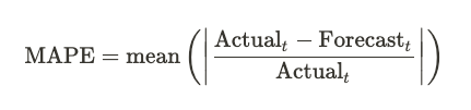
Mean Absolute Percentage Error (MAPE)
The mean absolute percentage error is an intuitive measure of the average degree to which a forecast is wrong. It has the advantage of easy interpretation, with a MAPE of 0.05 corresponding to being about 5% wrong, on average. The MAPE is defined exactly as we’d expect: it’s the mean of the absolute value of the error as a fraction of the true value.
MAPE, while interpretable, has some problems. It does not treat overprediction and underprediction symmetrically. The same error (as in, the same absolute difference between the forecast and true values) is more heavily punished when it is an overprediction than an underprediction. This can lead to selecting models that systematically under-forecast. Further, error from over-forecasting is unbounded when computing the MAPE: one can predict many times the true result, and MAPE will punish that in proportion. Conversely, error from under-forecasting is bounded; MAPE cannot allow more than a 100% under-forecast.
Further discussion of the shortcomings of MAPE (and other metrics) are given in Another look at measures of forecast accuracy by Hyndman and Koehler, which also proposed a new measure of forecast accuracy: the Mean Absolute Scaled Error.
Mean Absolute Scaled Error (MASE)
The mean absolute scaled error can help overcome some of the shortcomings of other measures of forecast quality. In particular, it bakes in the naive one-step ahead baseline forecast by scaling the error to the baseline error (the error of the baseline forecast) on the training set. As a result, any forecast can easily be compared to the baseline. If a method has a MASE greater than one, it is performing worse than the baseline did on the training set. A MASE of less than one is performing better. For instance, a MASE of 0.5 means that the method has a mean error that is half the error of the baseline on the training set.
MASE mitigates many of the problems with MAPE, including only going to infinity (which MAPE does when the observed value is zero), when every historical observation is exactly equal. This makes it particularly appropriate for intermittent demand (see Another look at forecast-accuracy metrics for intermittent demand). For more in-depth discussion of the considerations in choosing a forecast-accuracy metric, we recommend the linked papers.
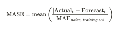
The baseline used when computing MASE is the naive one-step ahead forecast, but it can easily be extended to a seasonal variant.
Modeling electricity demand in California
To demonstrate the techniques outlined in our previous discussion, let’s tackle a real time series modeling problem: predicting electricity demand in California. The United States Energy Information Administration provides detailed and open information about the energy use of each US state. One can imagine myriad uses for accurate and timely projections of future energy usage: from upscaling and downscaling production to discovering outlandishly high or low usage in recent data.
To create our forecast, we’ll employ Facebook’s open source forecasting tool: Prophet.[3]
Prophet implements the components we described above: a generalized additive model with piecewise linear trend, multiple layers of seasonality modeled with Fourier series, and holiday effects. Under the hood, the model is implemented in the probabilistic programming language Stan. By default, it is not fully Bayesian, using only a (maximum a posteriori) point estimate of parameters to facilitate fast fitting. However, it does provide a measure of forecast uncertainty, arising from two sources.
The first is the intrinsic noise in the observations, which is treated as i.i.d., and normally distributed. In particular, Prophet makes no attempt to model the error beyond that. It is possible to include autoregressive terms in generalized additive models, but they come with trade-offs (which we’ll discuss later). The second is a novel approach to uncertainty in the trend. When forecasting the future trend, the model allows for changepoints with the same average frequency and magnitude as was observed in the historic data. If uncertainty in the components themselves is deemed desirable, the model can be fit with MCMC to return a full posterior for model parameters.
For a deeper dive into how Prophet works, we recommend its documentation, a paper called Forecasting at Scale, and this excellent twitter thread from Sean J. Taylor (one of the original authors of the paper).
Forecasting in action: developing a model for electricity demand
Electricity demand forecasting has a whole body of academic work associated with it.[4] In our case, the data serves as a real world example of a demand time series, with clear periodic components that are amenable to modeling with a generalized additive model. We’ll use this data as a test bed for where such models succeed and fail. Our intent is to demonstrate the application of generalized additive models to a forecasting problem and to describe the product implications for probabilistic forecasts, rather than ship an actual product. When tackling the same problem for the real world, we would advise consulting the detailed electricity demand forecasting literature in much greater depth than this report covers.
We’ll expose the model diagnostics for each of the models we build as an interactive dashboard, with top-line model comparison and the option to deep dive into each model. This custom app sits in an adjacent space to a pure experiment tracking system like MLFlow, and exhibits a philosophy we heartily endorse at Cloudera Fast Forward: build tools for your work. When you are not performing an ad-hoc bit of data science, but rather building towards a potential product, long-lasting system, or even a repeated report, it can pay dividends to think with the mindset of a product developer. “What parts of the work I am doing are repeatable? If I want a particular chart for this model, will I want it for all models?” Building abstractions always takes time, but it is front-loaded time. Once the model diagnostic suite is in place, we get model evaluation and comparison for free for all later models. Assuming modeling work will continue, this is likely a worthy investment of our time. It also, conveniently, provides us with the ability to provide screenshots as figures to support our discussion of the models, below.
The first approach: setting a baseline
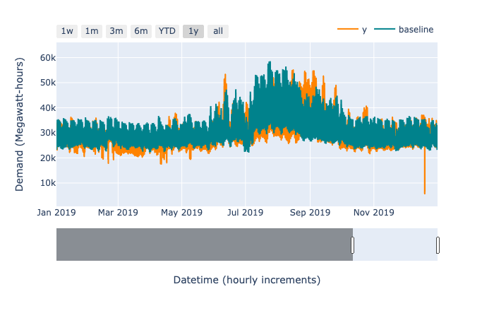
As we mentioned earlier, before employing any sophisticated forecasting model, it’s important to always establish a reasonable baseline against which to measure progress. For this application, we fit models on all the data through 2018 and hold out the whole year of 2019 for testing. Since we compare models on that same 2019 data set, we use 2020 YTD data for performance reporting of the final model.
The demand time series has clear yearly, weekly, and daily seasonality to be accounted for in our baseline. As such, our baseline forecast is to assign for each hour of 2019 a demand corresponding to that which occurs in the equivalent hour of 2018. Defining “equivalent” here is a little tricky, since the day of the year does not align with the dates, and there are strong weekday effects. When we settle for predicting exactly 52 weeks ahead, this ends up performing reasonably well—achieving a 8.31% MAPE on the holdout set.
Since this is effectively the same as the seasonal naive forecast, the MASE on the training set is exactly one, by definition. This is the baseline against which we scale other errors. The MASE of the baseline on the holdout set is 1.07, indicating that the baseline performs worse for 2019 than it does on average in the previous years.
Applying Prophet
Our next model uses Prophet to capture trend and seasonality at three levels: yearly, weekly, and daily. This is the default Prophet model, which is designed to apply to a large number of forecasting problems, and is often very good out of the box. Since we have several years of hourly data, we expect the default priors over the scale of seasonal variations to have little impact.
Again highlighting the importance of setting a baseline, this model actually underperforms the baseline! It’s MAPE is 8.85% on the holdout set, with a MASE 1.12. Let’s inspect the resulting forecast to investigate why.
Debugging the fit
One of the benefits of treating a time series as a curve fitting exercise is “debuggability.” The top line metrics (MAPE and MASE) do not really help here. They are important for model selection, but too coarse to help us improve the fit. When the fit is not good, there are several tools we can use to give us clues for how to improve it by iteratively increasing complexity.
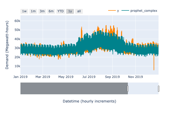
First, let’s look at the forecast against some actuals in the hold out test set. This can be incredibly revealing.[5]
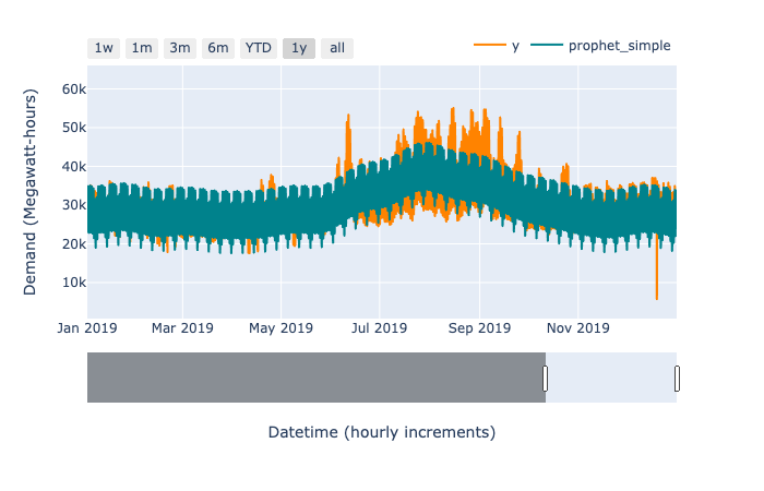
There’s an obvious spiky dip in the observed time series (depicted in orange in the figure above) in late 2019. This is likely caused by a power outage. There are several similar spikes of lower magnitude within the series. In principle, we could manually remove those data points entirely, and—since GAMs handle unevenly spaced observations naturally—our model would still work. In practice, the highly structured nature of the model makes it relatively robust to a handful of outliers, so we won’t remove them. (A practitioner with specialized domain knowledge of electricity forecasting would likely know how best to handle outliers.)
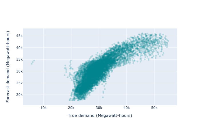
It is also useful to view a scatter plot of the forecast and predicted values (effectively marginalizing out time). This chart should show us if our model is preferentially overpredicting or underpredicting, and how dispersed its predictions are. We will likely have to deal with some overplotting issues, which we can do by either making the points transparent enough to effectively result in a density plot, or by making a density plot explicitly. The ideal predictor would produce a perfectly straight diagonal line of points. Due to noise in the observations, no model will provide a perfect fit; as such, the realistic goal is for the line constructed of scattered points to be as narrow and straight as possible. Here, the curve towards the x-axis indicates that we are preferentially underpredicting.
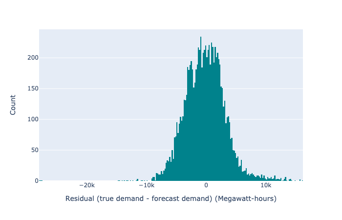
We can also look at a histogram of the residuals (the difference between forecast and prediction) to discover if we are favourably overplotting or underplotting. This should be an approximately normal distribution, and a better predictor will be strongly centred on zero and very narrow. Any secondary peaks (or strong skew) will flag that we have missed some systematic effect that may be causing us to consistently overpredict or underpredict in some circumstances.
Finally, we can look at autocorrelation plots. The autocorrelation of a time series tells us how correlated various time steps are with previous time steps. We should look at the autocorrelation of the residuals (we’d certainly expect there to be plenty of autocorrelation in the original time series and forecast). If there are strong correlations in the residuals, then we are effectively leaving signal unused.
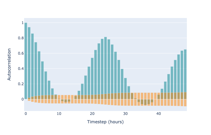
When using an autoregressive model, highly autocorrelated residuals are a sign of poor model fit. The same is true in the case of GAM-like structural time series (without autoregressive terms), but it is more expected. Autoregressive time series methods explicitly perform regression from earlier time points to later ones. In contrast, the GAM approach treats the points as independent and identically distributed, and bakes the time series nature into the structure of the model components. As such, with only a univariate time series input, we might expect that some local correlations (for example, from one hour to the next) are not caught. Nonetheless, autocorrelation can tell us which patterns we are failing to fit. It simply may be the case that we cannot fit those patterns with a structural time series that does not include autocorrelation. In our case, we clearly have strong autocorrelation within each day, and if we want to gain accuracy for forecasting the next few hours, we should certainly include autoregressive terms.
So why not autoregress?
It could be done, even with a Prophet-like model. In fact, we could implement it using the external regressor functionality of Prophet by feeding in lagged observations. However, in exchange for increased power to fit complex time series, we give up several things. The first is interpretability. A given prediction in Prophet is a sum of components that depend only on the time. With an autoregressive component (or indeed, any external regressor), the interpretation changes from “we predict x because it is 4pm on a Wednesday in summer” to “we predict x because it is 4pm on a Wednesday in summer, and the previous n points had some specific values.”
The second thing we sacrifice when we employ autoregression is the ability to gracefully handle missing data. Since autoregression needs to know the previous values of the time series, we must impute them through some other means before they can be used. (In contrast, it is a benefit of the curve fitting approach that we can naturally handle missing or even unequally spaced data with no modifications or imputation needed. After fitting, we can use the same forecasting method we use to predict the future to impute any missing data, if we like.)
Finally, autoregression restricts our ability to forecast far into the future. In order to regress on values, we must have those values. Using one-step ahead forecasting repeatedly is likely to compound forecasting errors very quickly, since we’re regressing on our own predictions.
Increasing complexity
By inspection of the forecast against past actuals, even on the training set, we can see where the default Prophet model failed. It does not capture the increased within-day variance in the summer months, and exhibits too much variance in the winter months (as noted in a figure above). We can improve this by changing the structure of the model.
Inspection of the historical data shows that the variance increases a lot within each day during summer, relative to winter. We allow for different daily patterns in summer and winter by including separate periodic components for each, and using an indicator variable to turn the components on and off. This allows for four separate kinds of within-day periodicities: weekdays in summer, weekends in summer, weekdays in winter, and weekends in winter.
A downside of the model being so structured is that we need to specify precisely what is meant by summer and winter. We use reasonable dates corresponding to changes in the historical time series, defining the summer patterns to apply from June 1st to September 30th. The true transition is not so stark as that, so we expect our forecast to be less reliable around those boundaries. Nonetheless, extending the model in this way results in a better fit than both the default Prophet model and the baseline, with a MAPE of 7.33% and a MASE of 0.94.
The final model
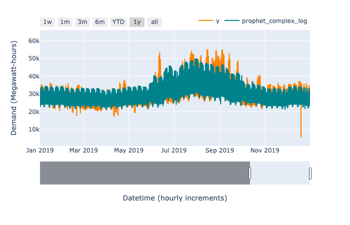
Naturally, we won’t stop exploring as soon as we beat the baseline. We still have the problem of a slightly unsatisfactory effect, where the overall variance of the forecast makes a step change between summer and winter. Looking closely at the training data, we notice that the within-day variance is proportional to the overall magnitude of the forecast. When electricity demand was high in summer, the within-day variation in demand was also high. When demand was lower in winter, the within-day variation was also lower. This motivates us to use a multiplicative interaction between trend and seasonal terms, rather than an additive one.
While Prophet supports multiplicative interactions between the overall trend and each seasonal term, it does not support multiplicative interactions between different seasonal terms. Since our data has a relatively flat trend, and the overall magnitude is determined principally by the annual seasonality, we need to seek another means of modeling this interaction.
Math comes to the rescue! We turn the fully additive model, where all components add together, into a fully multiplicative model, where all components combine multiplicatively (not just each component with the trend) by modeling the log of the electricity demand. Then, to get back to the true demand, we reverse the log transform by exponentiating the predictions of the model. This turns additive terms for the log demand into multiplicative terms for the true demand. When we apply this transform to our dataset, we see a much smoother transition between seasons, rather than the clear summer/winter split of the additive model. It also improves the MAPE and MASE over all previous models, with a MAPE of 6.95% and a MASE of 0.89.
Clearly the model is not perfect. However, with the diagnostic app, we can investigate the areas of good and poor fit.
There seem to be two primary things to improve. One source of error is that the predictions within a single day are the wrong shape; they are either not bimodal enough or too bimodal. This seems to persist for around a week at a time. The other source of error is the overall level of the prediction being incorrect for a given week. Both of these sources of error could likely be reduced with additional complexity in the model. Perhaps more granular patterns than a summer/winter split would work; It’s very likely that including outdoor temperature as an external regressor would improve the fit (this is a well-used feature in the electricity demand forecasting literature), provided we could reliably forecast the temperature.
One thing we note is that the in-sample error is lower than out-of-sample. The MAPE for a full year in-sample (2018) is 4.40%, whereas out-of-sample (2019), it is 6.95%. If the train and test data are similarly distributed, this could be an indication of overfitting. However, time series break the i.i.d. assumption; as such, we hypothesize that it is more likely that 2019 is distributed differently than the training data. One clue to this is that the out-of-sample performance of all the models we tried is worse than the in-sample. It may simply be, for instance, that there was a significant global trend in 2019, whereas our prediction must average over many possible trends.
Having selected this model, we can report metrics on a held out slice of the data that we did not use for model comparison. With a time series model, we usually want to train with the most up-todate data. This means that, unlike in the i.i.d. setting (where we can simply deploy the model we have tested), we have the unfortunate circumstance of never being able to fully assess the performance of the model we actually use. We must trust the performance of the same model trained on less recent data as a proxy. After retraining on all data up to 2020, we get a MAPE of 7.58% for 2020 (to October, the time of writing). The MASE, which is now calculated from the new training set, and (as such) cannot be compared to previous values, is 1.04, meaning this model performs worse on live data than the benchmark did on training data. A more relevant comparison is to the naive baseline on the testing data, which obtains a MAPE of 8.60%.
Forecasting
With a sufficient model in hand (now trained on all the data we have available), and its limitations understood, we can make forecasts. Forecasting is intrinsically hard,[6] and it is wise to treat the inherent uncertainty with the respect it deserves. Since the Prophet model is accompanied by uncertainty bounds derived from the uncertainty in trend and the noise, we should incorporate this in our forecast. As such, exposing a simple point prediction would be a poor user interface for our forecasts.[7]
Instead, let us envision how this forecast might be used. Our imaginary consumer is a person or team responsible for meeting the energy demands of California. They would like to know the forecast demand, of course, but also ask some more sophisticated questions. For instance, they would like to be alerted if there is a greater than 5% chance that the demand in any given hour of the week exceeds a specific amount. Point predictions alone are insufficient to calculate and manage risk.
We can represent our forecast, and the associated uncertainty, by sampling possible futures from the model. Note that we do not sample each time point independently. Each sample is a full, coherent future, for which we may compute whatever statistics we like. Working with samples affords us the ability to answer precisely the sort of probabilistic questions that an analyst working with the demand forecast might ask.
For instance, to provide an alert for probable high energy usage in an hour, we can simply draw 1000 samples, and filter these possible futures to only those for which there is an hour that exceeds some threshold that we choose. Then, we count the number of futures in which this is true, and divide it by 1000 (the original number of futures we sampled), and this gives us the probability of exceeding the threshold during at least one hour in a given week. Note that anything computed based on possible futures is subject to the assumptions of the model—and if the model is misspecified (in practice, all models are; it’s simply a question of by how much), we should distrust the computations we make in proportion to the degree of misspecification.
Assuming the model performs well-enough for our purposes, computing on possible futures is extremely powerful. A point-like forecast answers only one question: “What is the forecast at time t?” (or possibly an aggregate of that, e.g., “What is the forecast for the next week?”). In contrast, by sampling possible futures from the model, we can answer queries like “How likely is it that we will require more than X Megawatt-hours of energy next week?” alongside the point-like questions of “What is the most likely prediction for time point t?” and “How confident are we about the prediction?”
We present our electricity demand forecast with a simple app, constructed, like our diagnostic app, using the open source tools Streamlit and Plotly. The app reads one thousand sample forecasts (generated in batch offline) for one year ahead of the most recent observation. It displays a zoomable chart of the mean of those samples, and a selection of samples themselves to indicate the associated uncertainty. We report the aggregate demand in any selected time period (the sum of the hourly demand). We also expose a simple probabilistic question that would be impossible to answer with a point forecast: “What is the probability of the aggregate demand in the selected range exceeding a chosen threshold?” We envision that extended versions of this interface could provide a useful interface for analysts using forecasting to aid, for example, capacity planning.
Backcasting
Since our model depends only on time, we can run forecasts arbitrarily far into the future (though we will increase our uncertainty in the trend). Alternatively, we may “backcast” onto time periods that have already happened. This is particularly useful for two applications: imputing missing data, and anomaly detection.
Imputation
Situations in which data is missing can arise in a multitude of ways, including that the data was never collected. Imagine, for instance, if the telemetry for electricity demand simply failed for a few hours; there is no way to recover base data that does not exist.
Some methods require that there be no missing data, and we often end up imputing the missing data based on some average: perhaps the median value for similar examples, where “similar” is defined by an ad-hoc heuristic. For example, if we were missing a day of data, we might impute each hour as the median for that day-of-week among the surrounding two months. This heuristic is itself a model of the data, and probably a less sophisticated one than the model we aim to construct (after all, if it is more sophisticated, we ought to use it instead!).
Since we can fit a generalized additive model for a univariate time series with missing time steps just fine, we can use this much more sophisticated model to impute missing observations. Of course, this does not help us fit the model, so we should do it only if the missing data is of interest itself. Missing energy demand is just such a situation. Perhaps we wish to report the total energy demand for the month, and have one day of missing data. We ought to use the best imputation of that data available: in this case, our model. We could further use the uncertainty associated with that imputation to place bounds on the total demand.
Anomaly detection
To detect anomalous behaviour effectively often requires a definition of anomalous. There are many ways in which a time series can display anomalous behaviour. For the particular use case of electricity demand forecasting, we might desire to isolate incidents of unusually high or low demand at the hourly level. Another possible definition of anomalous behaviour could include a smaller excess demand sustained for several hours or days. Anomaly detection comes down to identifying events that are unlikely under the model. We could, for example, ask to be alerted to any single observation that lies outside the 99% uncertainty interval of forecast values (the region where 99% of samples lie).[8] This simple form of anomaly detection might be useful as a first attempt at automatic identification of historical outliers.
The future
Generalized additive models provide a flexible, interpretable, and broadly applicable basis for time series modeling, and can at the least provide an improved baseline for many time series problems. Prophet provides a mature and robust tool for the use of GAMs, and due to its success, we expect it to continue improving and becoming more flexible over time. Optimistically, we also hope to see the development of similar toolkits for other well-scoped problems.
Ethical considerations
Cynthia Rudin’s excellent paper, Stop Explaining Black Box Machine Learning Models for High Stakes Decisions and Use Interpretable Models Instead, advocates for using models that are themselves interpretable, instead of explaining black box models with additional models and approximations, especially when the model informs a high stakes decision; the prediction of criminal recidivism is given as an example. Since generalized additive models are a simple sum of components with known properties like periodicity or piecewise linearity, they are inherently interpretable in a way that methods which highly entangle their features (such as random forests or neural networks) are not. Because each component may be non-linear, they simultaneously provide a substantial increase in modeling flexibility over linear models.
The paper highlights that, in contrast to commonly held belief, there is not always a tradeoff between accuracy and interpretability. Intelligible Models for Classification and Regression quantifies this for generalized additive models, with a thorough empirical comparison between various GAM fitting methods and ensembles of trees. While the tree ensembles ultimately obtain the lowest error rates on most of the studied datasets, they do not always, and often the error rate is within one standard deviation of the closest GAM method (where the mean and variance for the error rates are calculated with cross-validation). As such, even when accuracy is the goal, it is often worth first pursuing an interpretable model, such as a GAM.
As we demonstrate with our simple forecasting app, capturing uncertainty in a forecast unlocks novel capabilities, like asking probabilistic questions. Moreover, being explicit about uncertainty is responsible data science practice.
Further research
Generalized additive models are not new, and are far from the only approach to solving time series problems. For univariate time series, The Automatic Statistician and related work in probabilistic programming (such as Time Series Structure Discovery via Probabilistic Program Synthesis) are particularly promising research directions, due to their efforts to automate the exploration of structural components.
Forecasting a single time series is an age-old problem, but the advent of the data age has exposed new shapes of time series problems. It is not uncommon to seek a forecast of hundreds, thousands, or even millions of concurrent time series, which necessitates a different approach. The recent success of transformer models for natural language processing is spurring work on applying attention-based architectures to discrete time series, as in Modeling Long- and Short-Term Temporal Patterns with Deep Neural Networks, Temporal Pattern Attention for Multivariate Time Series Forecasting, and Deep Transformer Models for Time Series Forecasting: The Influenza Prevalence Case. Such models seem well suited to automating time series forecasting for highly multivariate time series, though means for explaining the predictions of transformer models is an open research frontier.
Time series forecasting is perennially relevant, and while many established methodologies exist, the space does not lack for innovation. We look forward to seeing what the future holds, as new methods and tools develop.
Resources
The primary reference for Prophet is the paper, Forecasting at Scale.
If you’re interested in this structural approach to time series, you may be interested in probabilistic methods in general. In particular, we recommend Richard McElreath’s Statistical Rethinking, which does an excellent job of pedagogy, building Bayesian methods from simple intuitive foundations. (His lectures on the book are excellent as well, and you can find them via his YouTube channel). If you are more inclined to code (though we should note that Statistical Rethinking strongly emphasizes doing code exercises), you may also like Bayesian Methods for Hackers.
For more on general forecasting, the go-to reference is Forecasting: Principles and Practice.
A sparsity-inducing prior is a prior distribution for the probability of each changepoint that is highly peaked at zero; a Laplace distribution is often used. With such a prior, if we consider the vector of potential changepoints, it will likely turn out sparse (having many zeros). ↩︎
Note that this applies equally well to any train/validation/test data split of time series data. We should test and validate on data that occurs after the training data. ↩︎
We first wrote about Prophet around the time of its release in 2017: Taking Prophet for a Spin. ↩︎
Recognising that probabilistic methods had historically been underused in energy forecasting, the International Journal of Forecasting issued a special request for probabilistic energy forecasts in 2013. ↩︎
At one point in the development of our analysis, we had a programming error that messed up seasonality: we were trying to fit a long-term periodicity to short-term variations. This was not evident from top-line metrics; it simply looked to be a poorly-performing model. One look at the forecast against actuals, however, reveals that the model was not capturing within-day variations at all, and we had misspecified the duration of a seasonal component. ↩︎
The old Danish proverb applies here: “It is difficult to make predictions, especially about the future.” ↩︎
We did experiment briefly with the full MCMC fit for uncertainty bounds on all components. This is substantially more computationally intensive, and took several hours to run. In this case, the large amount of data available means that the posterior uncertainty on the components is small, so we reverted back to the simpler, faster, default MAP estimation. ↩︎
This is not the same as a confidence interval, but is more useful in this case. ↩︎